LinkedIn Carousel Size in 2026: Best Dimensions, PDF Settings, and Mistakes to Avoid
A lot of LinkedIn carousel advice starts and ends with "use 1080 × 1080." That's not wrong, but it's incomplete. What actually matters is how your carousel looks in the feed, how readable it feels on mobile, and whether slide one is strong enough to earn the first swipe.
What people call a "LinkedIn carousel" is usually a multi-page document post uploaded as a PDF. LinkedIn supports PDF, DOC, DOCX, PPT, and PPTX files up to 100 MB and 300 pages — but PDF is still the safest format if you care about consistent layout, typography, and slide order.
LinkedIn carousel size cheat sheet
- Square carousel: 1080 × 1080 px — safe cross-device default, great for reusable branded formats
- Portrait carousel: 1080 × 1350 px — stronger mobile presence, better for educational and text-led posts
- Wide carousel: 1920 × 1080 px — best for tables, timelines, and wide screenshots; weaker on mobile
- Best file format: PDF — preserves slide order, typography, and layout most reliably
- Maximum file size: 100 MB (LinkedIn's hard cap; keep it lighter in practice)
- Maximum page count: 300 pages (technically allowed — absolutely not a performance recommendation)
- Best page count in practice: 8–12 slides — enough to teach one idea without losing people halfway
Best LinkedIn carousel size: the quick answer
For most creators and brands, the two best working LinkedIn carousel sizes are 1080 × 1080 px for square decks and 1080 × 1350 px for portrait decks. Square is the safest all-rounder. Portrait usually wins when the goal is stronger mobile presence and easier reading for text-heavy educational content.
Simple rule: use 1080 × 1350 px for teaching, storytelling, and swipe-heavy personal-brand content. Use 1080 × 1080 px when you want easier reuse across channels or a more flexible template for mixed visual elements. Wider layouts like 1920 × 1080 px are a niche choice — they can work for dashboards and comparison slides, but tend to feel weaker on mobile.
Square vs portrait vs wide: which LinkedIn carousel format to use
When square (1080 × 1080 px) is the right choice
Square carousels are the safest default if you want a format that works across desktop and mobile without drama. They're especially useful for quote slides, simple frameworks, before-and-after examples, branded series, and content you plan to reuse on other platforms. Square is also forgiving — it handles mixed content types well when you have icons, screenshots, short copy blocks, or visuals that don't naturally fit a taller frame. The trade-off is attention: square takes up less vertical feed space than portrait, so your opener has to work harder.
When portrait (1080 × 1350 px) performs better
Portrait carousels are usually the strongest option for educational decks, swipeable frameworks, story-driven breakdowns, and anything that relies on a strong headline with breathing room below it. The format gives text more space and feels better on mobile, where most LinkedIn browsing happens. If your content is built to teach fast, portrait is usually the best working standard — it lets you keep the first slide bold, body copy readable, and overall hierarchy cleaner without squeezing everything into a square box.
When wide (1920 × 1080 px) makes sense
Wide carousels work best when the content is naturally wide: comparison tables, product interfaces, org charts, timelines, or complex side-by-side visuals. The downside is obvious — wide slides lose feed presence on mobile and can feel weaker on that all-important first swipe. Use them when clarity genuinely requires the extra width, not because they "look more professional" in a design tool.
PDF or image carousel: which is better?
For most LinkedIn education content, thought leadership, hiring posts, founder storytelling, or B2B explainers — PDF is the better choice. It keeps the whole sequence intact, holds typography together, and feels much more like a real slide deck than a stack of images. Document posts consistently drive strong engagement partly because the format signals effort and depth.
Image-based sequences work for photo recaps, moodboards, event galleries, or simple visual showcases — but they're weaker when the value depends on structure, pacing, and text consistency. In short: use images when the visual is the point, use PDFs when the sequence is the point.
Designing for mobile and desktop safe zones
Correct LinkedIn carousel size is only half the job. The second half is keeping important content away from the edges so it reads cleanly on every screen. A perfectly sized slide can still underperform if the text is jammed into corners, the CTA sits too close to the bottom edge, or the layout only works when someone zooms in.
A simple structural rule: keep your hook in the upper area, your core visual or argument in the center, and any branding or continuation cue near the bottom without hugging the edge. That structure makes slides easier to process fast and keeps the deck feeling stable across devices.
If your carousel relies on tiny page numbers, thin footnotes, cramped charts, or body text that only works on a large monitor, it's not done yet. LinkedIn is a feed environment first, not a presentation room.
Export settings that keep LinkedIn carousels sharp
Use PDF as the final export format whenever possible. It's the cleanest way to preserve page order, spacing, and typography, and it reduces the chances of a good-looking design falling apart once it leaves Canva, Figma, or PowerPoint.
Keep the file comfortably below LinkedIn's 100 MB limit even though the platform allows the full cap. A lighter PDF is easier to QA, faster to upload, and a better real-world experience for people swiping on mobile.
For resolution, don't obsess over print-grade export settings. What matters is crisp text and clean graphics on screen. Standard high-quality screen settings are enough as long as you're not scaling up weak assets or flattening text into blurry raster images.
Common LinkedIn carousel mistakes to avoid
- Mixing aspect ratios inside one deck — LinkedIn treats the first slide as the reference for the rest. Pick one format and stick with it across the whole file.
- Blurry text — usually caused by bad scaling, low-quality assets, or exporting slides as raster-heavy images instead of a clean PDF.
- Too much content per slide — a carousel is not a whitepaper with branding on top. One clear point per slide keeps swipe momentum going.
- A weak first slide — people decide whether to swipe almost immediately. Slide one should promise a payoff, not introduce your company in the most corporate way possible.
- Overdesigned layouts — noisy backgrounds, inconsistent margins, and random visual tricks make even a good message harder to consume.
The part most carousel guides skip: your profile has to convert
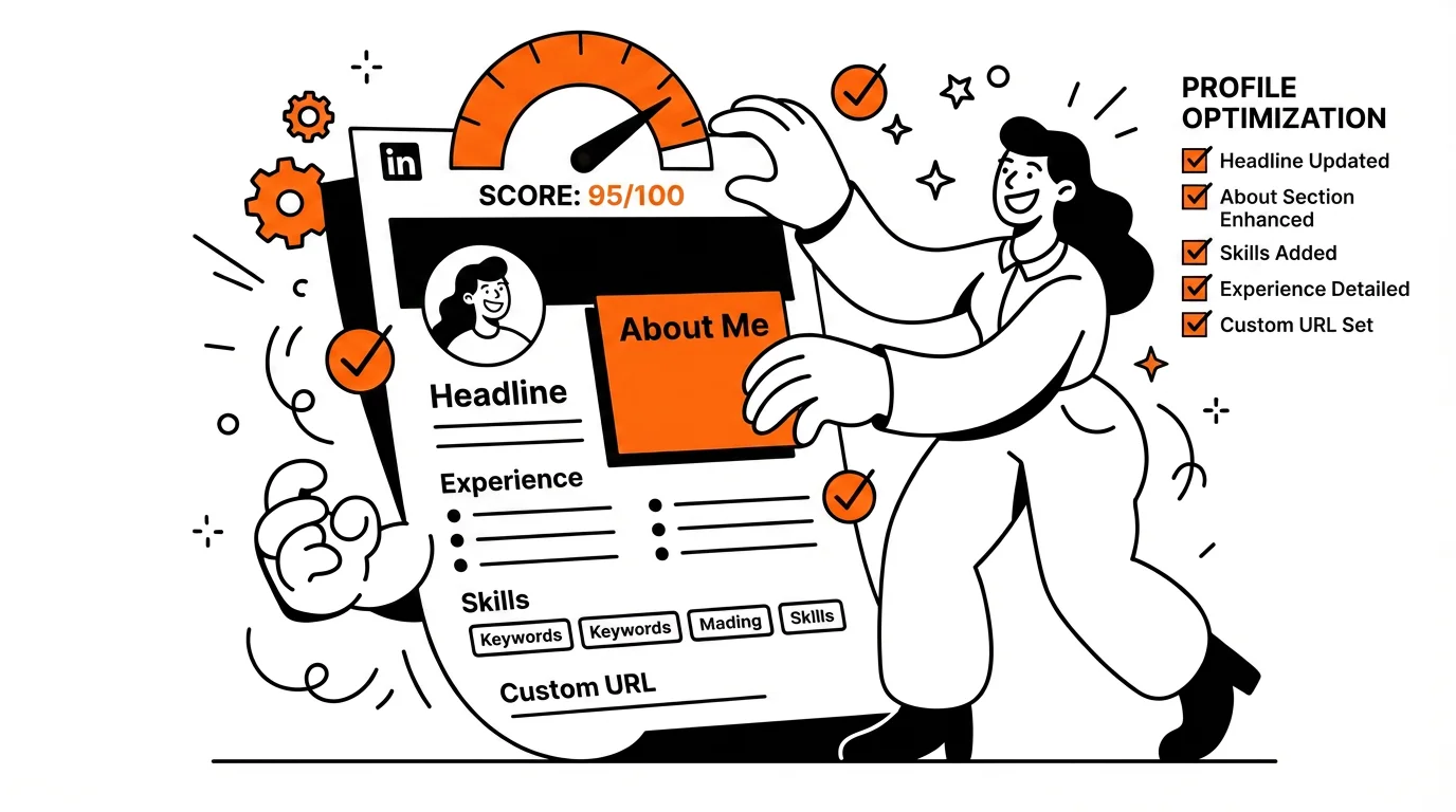
A strong carousel can boost reach, profile views, and authority. But if people click through and land on a weak profile, the opportunity ends there. Content performance and profile quality are one system, not two separate projects.
If your carousels are getting attention but not converting that into replies, connections, recruiter interest, or leads, the fix often isn't more content — it's a sharper profile. Check your headline, banner, About section, and overall completeness with the free LinkedIn Profile Checker. In plain terms: don't spend two hours tweaking carousel margins if your profile still says "experienced professional" and gives people no reason to message you.
Related resources
- LinkedIn Profile Checker — free 0–100 profile score with actionable feedback
- LinkedIn Image Sizes 2026 — profile photo, banner, and post dimensions
- How to Use LinkedIn to Find Jobs — a practical system for job searching on LinkedIn in 2026
- ATS Resume Checker — score your resume against ATS requirements
- Top 10 Resume Mistakes — common errors that cost candidates interviews
Frequently Asked Questions
What is the best LinkedIn carousel size in 2026?
1080 × 1350 px (portrait) is the strongest default for most content because it takes up more feed space on mobile and gives text more room to breathe. 1080 × 1080 px (square) is the safer all-rounder if you want easier cross-platform reuse. Both work well — the choice comes down to your content type and audience.
What file format should I use for a LinkedIn carousel?
PDF. It's the most reliable format for preserving slide order, typography, and layout across uploads. LinkedIn also accepts DOC, DOCX, PPT, and PPTX, but PDF is the safest choice if consistent rendering matters to you.
How many slides should a LinkedIn carousel have?
8–12 slides is the sweet spot for most educational and thought-leadership carousels. That's enough to develop one idea fully without losing people partway through. LinkedIn technically supports up to 300 pages, but deck length is a readability decision, not a technical one.
Why does my LinkedIn carousel look blurry?
Usually because slides were exported as rasterized images at low resolution, or because assets were scaled up from a small original. Export as a clean PDF rather than flattening everything to images, and make sure your source files are at full resolution before exporting.
Does LinkedIn carousel size affect reach or engagement?
Indirectly, yes. Portrait carousels take up more vertical space in the mobile feed, which can increase the chance that slide one gets noticed before someone scrolls past. But the bigger driver of engagement is always the content and the hook — size gives you a structural advantage, not a free pass on quality.
Conclusion
For most LinkedIn carousel content in 2026, start with 1080 × 1350 px portrait for mobile-first readability, or 1080 × 1080 px square for versatility. Export as PDF, keep decks to 8–12 slides, test on your phone before publishing, and keep text well clear of the edges. Those decisions alone will put your carousel ahead of most of what's in the feed.
And once the carousel is working, make sure your profile is ready for the traffic it sends. The free ApplyMate LinkedIn Profile Checker takes a few minutes and tells you exactly what to fix.