LinkedIn Image Sizes in 2026: Best Dimensions for Profile Photos, Banners, and Posts
Getting your LinkedIn image sizes right is one of the fastest, most underrated profile fixes out there. Blurry profile photos, weirdly cropped banners, and text that disappears behind your own headshot are dead giveaways of a profile that hasn't had attention lately — and recruiters notice before they ever read your headline.
This guide covers every LinkedIn image dimension you're likely to need in 2026: profile photo, personal cover photo, company page logo and banner, feed post images, and event covers. All in one place, with the context that actually matters.
Quick LinkedIn image size cheat sheet for 2026
Here's the full list before we go into the details:
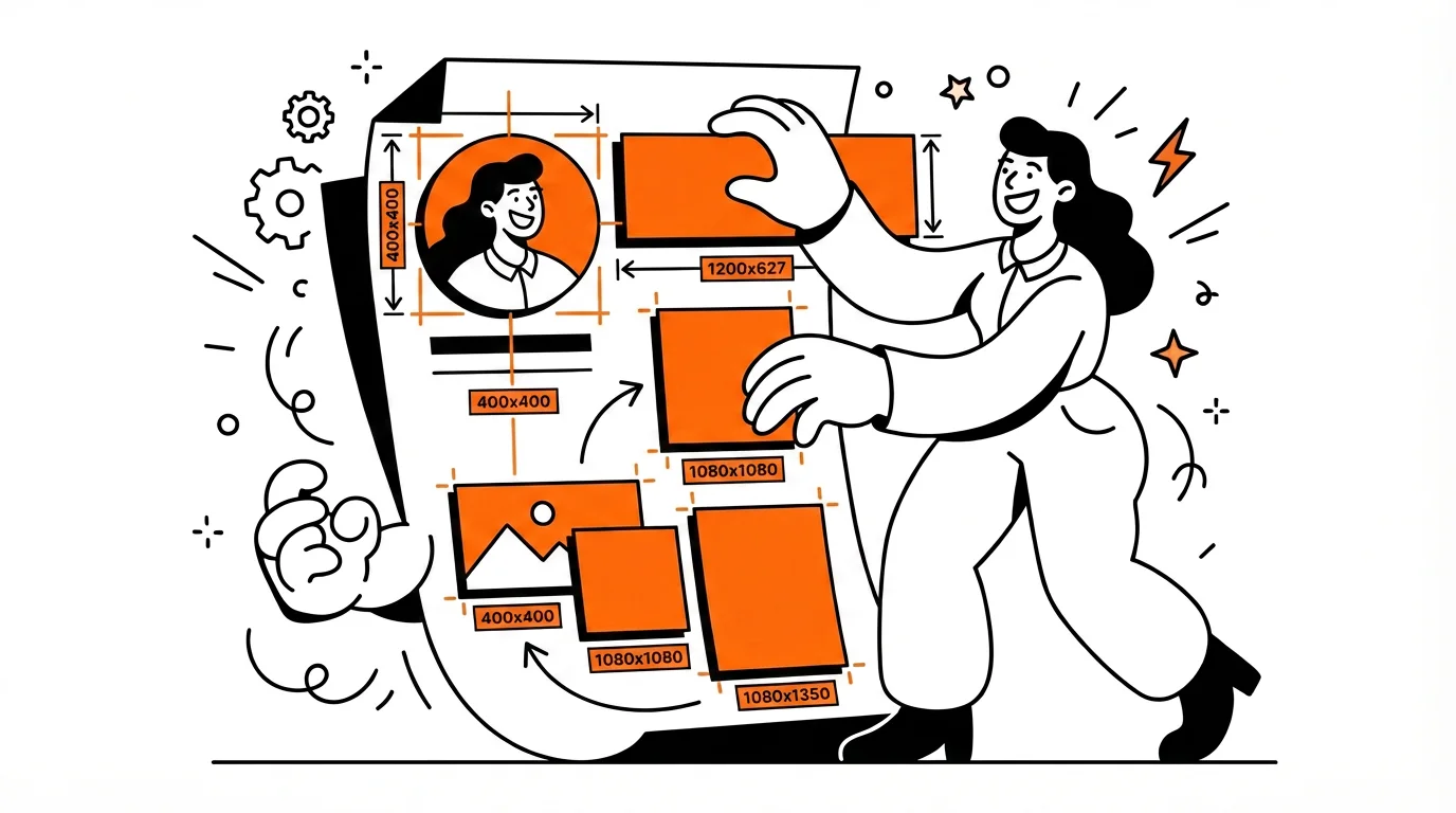
- Profile photo: 400 × 400 px (displayed as a circle)
- Personal cover photo: 1584 × 396 px (4:1 ratio)
- Company logo: 300 × 300 px minimum; 400 × 400 px for sharper rendering
- Company page cover: 1128 × 191 px
- Company Life tab hero: 1128 × 376 px
- Feed post, landscape: 1200 × 627 px
- Feed post, square: 1200 × 1200 px
- Feed post, vertical: 720 × 900 px
- Event cover image: 1776 × 444 px
These dimensions come from a combination of Hootsuite's social media size guide and Figma's LinkedIn size reference — both of which are kept current as LinkedIn updates its layout.
Why LinkedIn image sizes matter more than you think
The obvious problem with wrong dimensions is image quality: pixelated photos, banners that look zoomed in at 300%, logos that blur into a smudge. But the less obvious problem is layout. LinkedIn renders images differently on desktop vs. mobile, and it doesn't warn you when something looks bad in one context but not the other.
There's also a trust dimension. Clean, correctly sized visuals signal that you're paying attention. Recruiters and hiring managers scan LinkedIn profiles fast — eye-tracking research suggests seconds, not minutes. A blurry photo or a banner with important text hiding behind your own face is a friction point that works against you before anyone reads a word.
Beyond quality, aspect ratios matter as much as raw pixel counts. A 1584 × 396 px banner is a 4:1 ratio — that ratio is what keeps it from being cropped in unexpected ways, regardless of screen size.
Best LinkedIn profile photo size
Use a square image at 400 × 400 px or larger. LinkedIn crops it into a circle, so anything important near the corners will disappear. Keep your face centered, well-lit, and filling most of the frame.
What actually makes a good LinkedIn profile photo for job seekers:
- Clean, non-distracting background (solid color, simple office, or outdoors without clutter)
- Face and shoulders visible — not a full-body shot, not a cropped group photo
- Good, even light — avoid harsh shadows or bright windows directly behind you
- No filters, no vacation photos, no sunglasses
LinkedIn is often the first thing a recruiter checks after seeing your resume. The profile photo either reinforces that first impression or undermines it. If you're actively job hunting, it's worth treating this as seriously as you'd treat a headshot for a portfolio.
Best LinkedIn cover photo size
For a personal LinkedIn banner, use 1584 × 396 px. This is the standard 4:1 aspect ratio and it's what LinkedIn expects. Anything wider or narrower will either get cropped or leave empty space.
One thing people keep getting wrong: your profile photo sits in the lower-left corner of the banner. If you're adding text, a tagline, contact info, or a brand logo, keep it in the center or right side — otherwise your own face will cover it.
What to actually put on a LinkedIn banner
Your cover photo is prime personal branding space. Some options that work well:
- A short, specific tagline that reinforces your headline
- Your industry or specialty (e.g., "Product Design · B2B SaaS")
- A clean visual from your field — code, a workspace, a portfolio piece
- Minimal color + your name or contact URL if you're actively job hunting
Keep it clean. Busy banners with tiny text don't scale well to mobile. When in doubt, less is more.
Best LinkedIn company page image sizes
A company page needs two images: the logo and the cover banner.
Company logo
Use a square image — 300 × 300 px is the commonly cited minimum, but 400 × 400 px gives you noticeably sharper rendering in more contexts (search results, notifications, follower lists). If your logo is horizontal, pad it to a square with a solid or transparent background rather than stretching it.
Company page cover image
Use 1128 × 191 px for the standard company banner. It's significantly flatter than a personal banner — think brand strip rather than hero image. That means don't try to squeeze a full product screenshot or a three-column layout into it. A clean color, a simple brand message, and readable type are all you need.
If your company uses the Life tab, the main hero image there is 1128 × 376 px — more vertical breathing room, better for culture photos or team shots.
Best LinkedIn post image sizes for the feed
LinkedIn post images come in three orientations, and the right one depends on what you're trying to do:
Landscape: 1200 × 627 px
This is the safest default for most feed posts. It matches the standard open graph preview format, looks clean on desktop and mobile, and works well for branded graphics, quote cards, announcements, and any content where you want a wide visual.
Square: 1200 × 1200 px
Square posts feel balanced and often perform well in the feed because they take up more vertical space on mobile without going full portrait. Good for single-stat visuals, quote graphics, or carousels where consistent sizing across slides matters.
Vertical: 720 × 900 px
Vertical images claim the most feed real estate on mobile — which is where most LinkedIn browsing happens. The tradeoff is that they can look out of place on desktop. Use vertical for educational posts or storytelling sequences where mobile-first viewing makes sense, and keep text large enough to read on a small screen.
Mobile vs. desktop: where LinkedIn image sizes actually get tricky
Desktop LinkedIn gives you more space and context. Mobile is where cropping happens without warning. Wide banners with text near the edges, post graphics with tiny callouts, logos scaled down to thumbnail size — these all degrade faster on mobile than they look in your design tool.
A few rules that help:
- Keep important text at least 10–15% away from any edge, especially on banners
- Never use a font size smaller than ~24px in post graphics — anything smaller becomes unreadable at mobile scale
- Preview every asset on your phone before publishing — "it looked fine in Canva" is not a strategy
- For company logos: test at the smallest size you'll encounter (search results, comment avatars) before calling it done
Common LinkedIn image mistakes to avoid
- Wrong banner ratio: Uploading a non-4:1 banner leads to unexpected cropping or awkward empty space. Always start from the correct dimensions rather than resizing after.
- Text behind your profile photo: Your headshot covers the lower-left corner of your banner. Any text or logo in that zone is invisible to visitors.
- Low-res logos and profile photos: A blurry photo signals neglect. It's a small thing that reads as bigger than it is.
- Designing for one format: A landscape post graphic will look different at 1200 × 627 px and at 1200 × 1200 px. If you're repurposing content, resize intentionally rather than stretching.
- Overcrowding: Too much text, too many icons, microscopic details — all of it collapses at mobile scale. Simpler wins.
Tools for creating and resizing LinkedIn images
Canva remains the fastest option for most people — it has LinkedIn-specific templates pre-sized to the right dimensions, easy drag-and-drop, and quick export. Good for banners, post graphics, and company covers.
If you want more design control or you're working in a team with a shared brand system, Figma is a better fit. Their LinkedIn size guide is also a useful standalone reference.
For Adobe users, Adobe Express handles quick social graphics cleanly without needing Photoshop or Illustrator for every resize.
Related resources
If you're overhauling your LinkedIn presence, these tools and guides can help with the content side too:
- LinkedIn Profile Checker — analyze your profile for keyword gaps, headline strength, and recruiter visibility
- LinkedIn Carousel Size Guide — best dimensions, PDF settings, and common mistakes for carousel posts
- How to Use LinkedIn to Find Jobs — a practical system for job searching on LinkedIn in 2026
- ATS Resume Checker — score your resume against ATS requirements before applying
- ATS Resume Optimization Tips — how to tailor your resume for applicant tracking systems
- Top 10 Resume Mistakes — common errors that cost candidates interviews
- ATS Resume Template — a free, ATS-friendly template to start from
Frequently Asked Questions
What is the best size for a LinkedIn profile photo in 2026?
400 × 400 px is the standard recommended size, though LinkedIn accepts up to 8MB and dimensions up to 20,000 × 20,000 px. The key is keeping it square — LinkedIn crops all profile photos into a circle, so anything in the corners gets cut. Center your face, use good lighting, and keep the background clean.
What size should my LinkedIn banner be?
For a personal profile, use 1584 × 396 px (4:1 aspect ratio). For a company page cover, use 1128 × 191 px. Both will look sharp on desktop and mobile if you start from those dimensions rather than resizing something designed at a different ratio.
What LinkedIn post image size gets the most engagement?
There's no single answer, but 1200 × 627 px (landscape) is the safest default — it renders cleanly across devices and matches the standard open graph format. Square posts (1200 × 1200 px) tend to take up more feed space on mobile, which some creators prefer. Vertical (720 × 900 px) is the most aggressive for mobile visibility but can look cramped on desktop.
Why does my LinkedIn banner look blurry or cropped?
Usually because the original image was uploaded at the wrong dimensions or aspect ratio. LinkedIn will stretch or crop images that don't match expected dimensions, which causes blurring and unexpected cuts. Start from 1584 × 396 px for personal banners and 1128 × 191 px for company pages, and export at full resolution.
Does LinkedIn profile photo size affect visibility or search ranking?
Image size itself doesn't affect LinkedIn's search algorithm, but having a profile photo at all does — profiles with photos get significantly more views than those without. More importantly, a sharp, professional-looking photo affects how recruiters perceive you once they do land on your profile. Use the right size so the quality speaks for itself.
Conclusion
The right LinkedIn image sizes aren't complicated — but they're easy to get wrong, and the visual difference between a properly sized profile and a sloppy one is immediately obvious to anyone looking. Use 400 × 400 px for your profile photo, 1584 × 396 px for your personal banner, and the appropriate post dimensions for whatever you're sharing in the feed. Start from the right dimensions every time rather than resizing after the fact, and always preview on mobile before you call it done.
Once the visuals are in order, the next step is making sure your profile content — headline, summary, skills, experience — is as sharp as the images. Our LinkedIn Profile Checker can help with that.